Aesthetic and Practical Solutions.
(858) 751-4407
San Diego, CA
Mon - Fri: 10:00AM - 5:00PM, Sat/Sun: 12:00PM - 5:00PM
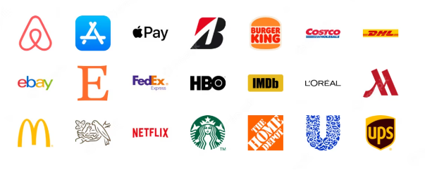 If you were to think of a big company name that doesn’t have a logo, you’ll have a hard time coming up with one. It’s because modern businesses consider logos as vital as the product — to the point, that sometimes, it is the product. Consider luxury items like Louis Vuitton and Chanel. “It’s not just a bag, it’s Hermes.” as the saying goes. Every non-tech item that has been slapped with an Apple logo is sure to sell. And those Nike Dunk shoes? They’re not sturdier, but hey they’re Nike, so they gotta be. Of course, let’s face it. Not all startups and businesses that start in a garage will live up to the likes of Amazon, Coca-Cola, and Harley Davidson. Most will fall in the commodity category, that is items we consider buying due to their low price and convenience, but they’re never favorites or loved solely because of their name. Still, we’re rooting for that small percentage that one day, our brand might be the next big thing. But it can never truly happen if we forego that one factor that might give us the brand-loyalty edge: logos. If you want to copy the success of McDonald’s, Starbucks, PayPal, Lego, and Nike, you might want to do the easiest and the most basic of their strategy: designing a wonderful logo. Why are logos important? There are so many benefits of logos to a company or an organization. But the most obvious ones are something related to identity. A logo is a single brick in-house construction. Without this single piece, the house is incomplete, or worse, it falls apart. It has to be of the same size, quality, and material as all the other bricks. And it has to be glued in perfectly or it will come loosely, undoing your hard work. Logos might not be the most important part of a business, others come first such as value proposition, marketing efforts, and innovation. But logos can stagnate the growth of a business by simply being unappealing and inconsistent. Imagine your favorite brand changing its logo every year. How about their logo being stylistically different in every packaging? Sure, you’re still going to buy from them, after all, they’re your favorite and you love their marketing or their products. But some people will be hesitant. And hesitant is not a good word. Let’s create a company logo! A company logo is not so difficult to create. Sure, it might take some time and money. But it shouldn’t be that difficult if you follow our ultimate steps. Don’t worry by the end of this article, you will have a clear working map of how to navigate the logo design world. And sure, it might take some time, but with the assurance that you’re doing it right. Hopefully, you will have created a wonderful logo that works for you and your industry — something you can upload on many platforms and places like billboards, websites, boutiques, Facebook ads, Instagram pages, and many more. Step 1: Understand the brand First off the list, you need to have a clear understanding of your business. Ask yourself certain questions like “What are your values, mission, vision, and goals?” “What are your products and service offers and their differences from others of their kind? “Who are your target customers?”. Define their demographics, psychographics, behavior, and geographic location. When you understand your brand, your logo will accurately reflect that identity. Whether you’re the designer yourself or you hire a professional, the logo design process will be a lot easier because you have a stack of information to get inspired from.  Step 2: Simplicity is key Logos used to be complicated. That was just the trend at the time and that time was gone. If you want to win in today’s jam packed modern world, you need to simplify your logos. And when simplified, it doesn’t mean dumbed down, unappealing, and too generic. It only means understandable, legible, not cluttered, few symbols and details. Simplicity is not foregoing beauty and aesthetics. In fact, it values them even more. Simplicity is simply “enough beauty”. Take Apple’s logo. Perhaps one of the most iconic logos to grace our time, Apple understood simplicity to the bone. The minimalist take on an apple-icon-with-a-bite is what propels Apple’s image to greater heights, of course with the help of its stellar products and marketing copies. Moreover, a simple design helps your business be easy to recognize. For example, Nike’s check symbols are universally known. A pair of shoes doesn’t have to contain the name “Nike” for people to tell it’s Jordan or Dunks. That check symbol tells everything about where it’s from. Step 3: Choose the right colorsColor impacts the brand a lot. According to a Loyal Maryland Study, 90 percent of snap judgements on products can be based on color alone. That’s a huge deciding factor. If that’s the case, then color can impact your bottom line. Therefore, it’s worth giving a second, third, or fourth thought. Color psychology is the study of colors and its impacts on the human psyche. Marketing professionals love this aspect because they know that just by picking the perfect combination, they can nudge the buyer to buy more. And the opposite is dreadful. Without understanding color psychology, your product could end up at the bottom of the shelf, or worse, not on the shelf at all. Here are basic color information that you can use on your logo design process: 
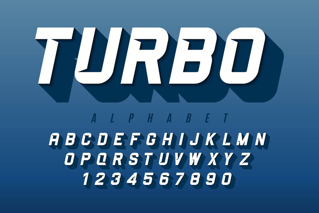 Step 4: Select the appropriate typography If you choose a logo that is based on typeface, then the font style comes front and center than icons, symbols, and emblems. Now there are so many ways to be unique in this world of wordmarks. But there are usually two routes to go for, one is serif and the other is sans serif. Serifs are letters with a leg at the end of each letter stroke, while sans serif comes without. There are less prominent categories too, such as decorative and script. Modern logos use sans serif, and antiquated, established organizations opt for a serif typeface. An example of sans serifs are Google and Facebook, and for serifs, Harvard University and Cartier come to mind. You can or you can’t follow this general guideline, of course. After all, it depends on your preferred image and overall look. But it doesn’t hurt to look at these formats for inspiration. One thing is for sure, like icons and symbols, typefaces should be easily understandable. Legibility is the name of the game. You don’t want people to misread your brand or mistake you for something else, right? Step 5: Test and iterate How do you say, “Yes, this is it!” to your final logo design? You test it. How? You send them to friends, family, and colleagues. They can offer bankable ideas and comments on its looks. But most importantly, you send them to trusted potential customers. By having it seen from their perspective, you can test whether your assumption is right— assumption on the emotion that it evokes, as well as the information it tells. Prior to publication, your logo design is subject to so many tests and revisions. And don’t skip this step, because once you publish it and it goes live, it may be a lot more difficult to make some changes. So, keep on revising and refining your logo design. Test it on different platforms such as Facebook, Twitter, and Reddit, and varied materials like cardboard, glossy paper, foil bag, and more. Step 6: Hire a professional designer Let’s be honest here, how many people can start a business? A lot. But how many of those people can go on Adobe Illustrator, open a file, draw multiple curves, mix colors, and export it in an expandable format? Not many. You might have the idea but transferring that idea from the brand to the page requires hard-earned skills. That’s why if you want your logo to perform well in the market, you might want to consider a professional. A professional logo designer knows the ins and outs of branding. Apart from your input such as the color, shape, size, icon, and font, the designer can consider symmetry, style, and many others. Your designer will package your ideas into one marketable product. The perfect designer might be expensive. So be open to getting charged more. If you want cheap quality, then a penny pinch on your designer. But a quality output needs a quality designer. You can try stock photos, logo maker tools, and AI generation platforms for inspiration, but the final touch should be your hired designers to take. Step 7: Protect your logo Your logos are not invincible from piracy and copyright infringement. That’s why at this stage, it’s best to know the rules and regulations surrounding copyright so you can better protect your creative work. It’s important to do this early on because, remember, your logo will stay with you probably forever. And if someone chooses to copy your logo, you might have a problem with your branding and your unique projection down the line. Also, knowing copyright rules help prevent you from unknowingly copying other designs. Because you know that such rules exist, you might take deeper research about your industry, your products, and your potential competitors. Once you’ve finalized the design, don’t delay the trademark and copyright registration. The sooner you do so, the more you have power over your design protection. So what have we learned? While logos are not the end-all-be-all of branding, your attitude toward logo creation says a lot about how serious you are about your business's success. There will be more incredible challenges to tackle, and if you haven’t practiced your problem-solving skills with your logo (the basics of all business), then you might have bitten more than you can chew. Overall, logos should be taken into consideration when planning the overall brand strategy. After all, it’s the first thing people see, more than anything else — more than products and more than owners. So, take your time in designing the perfect logo design for you. And, cross your fingers, and hope for the best!  Author's Bio
Janella Malapad - Janella is an outreach specialist at BrandCrowd, an online marketplace that specializes in facilitating the buying and selling of logos and domains through their logo maker platform. Your comment will be posted after it is approved.
Leave a Reply. |

 RSS Feed


5/30/2023
0 Comments